Food + City
IDENTITY
PUBLICATION DESIGN
COLLATERAL
WEB DESIGN
Food+City is a non-profit organization that provokes fresh perspectives on the realities of how we feed cities.
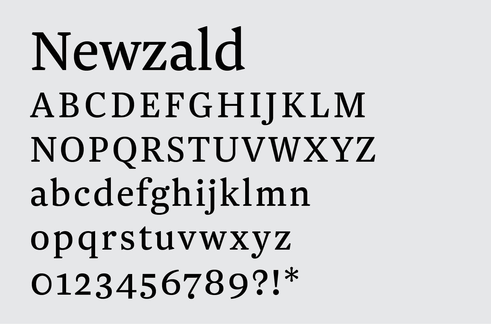
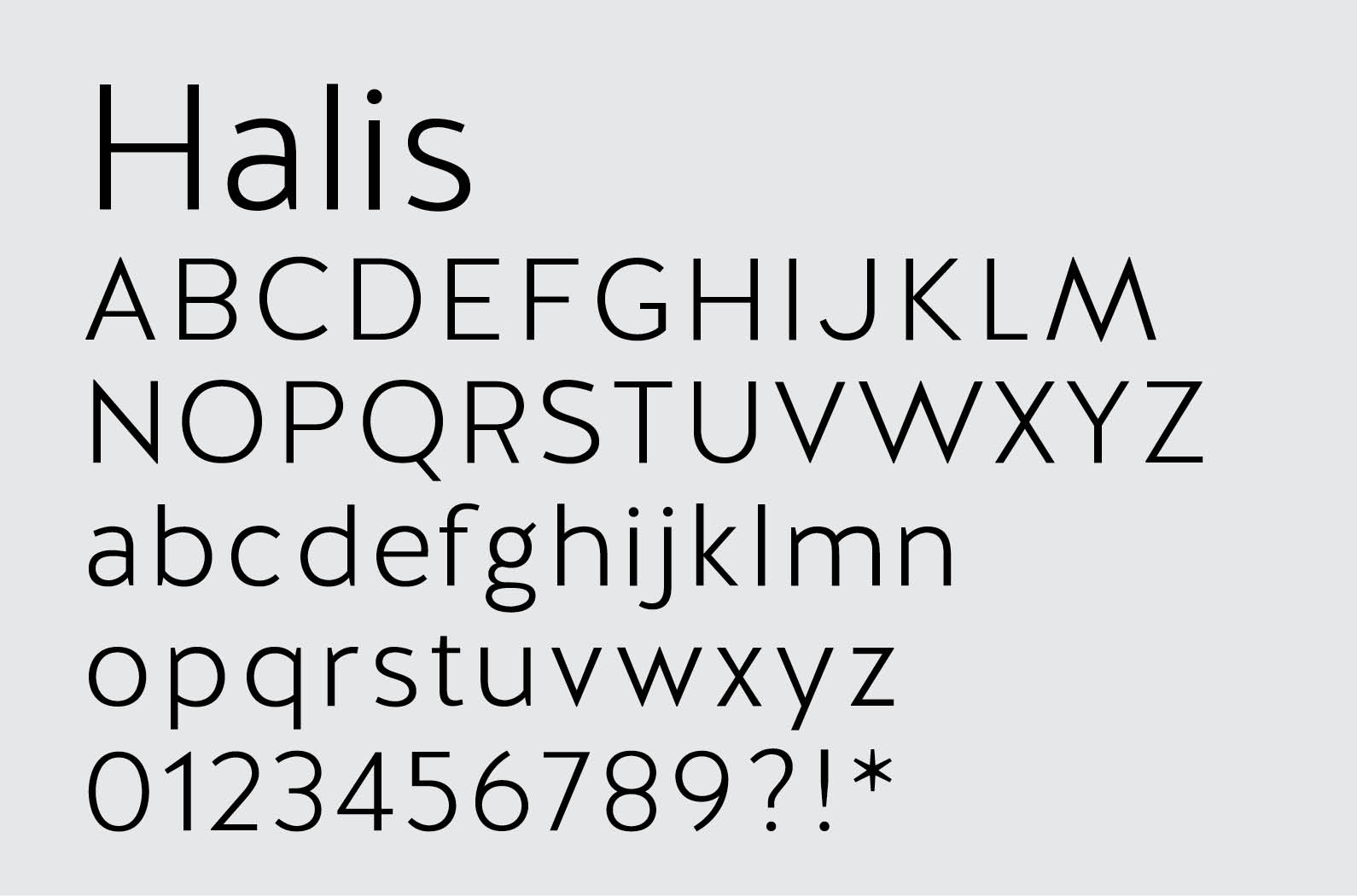
Our work with them began with the creation of the brand and flagship magazine and continued with event materials, their website and design and production of the magazine until it ceased publication.
Visit their site here.
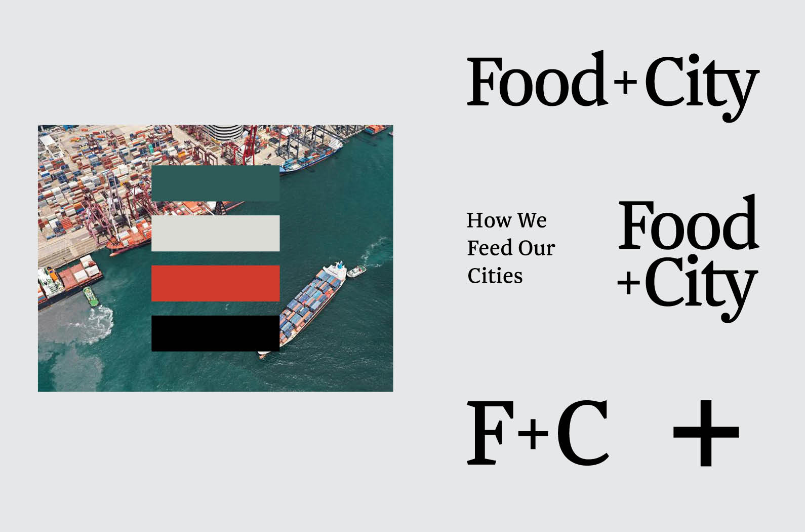
Many of the conversations Food+City fosters center around supply chain logistics. Brand colors were taken from images of iconic container ships in port as well as food photos to strike a balance between the humanity + technology involved in the process.
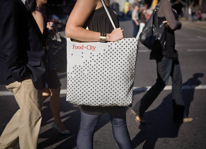
The plus sign in the name became a useful pattern for merch, event materials and house ads in the magazine.
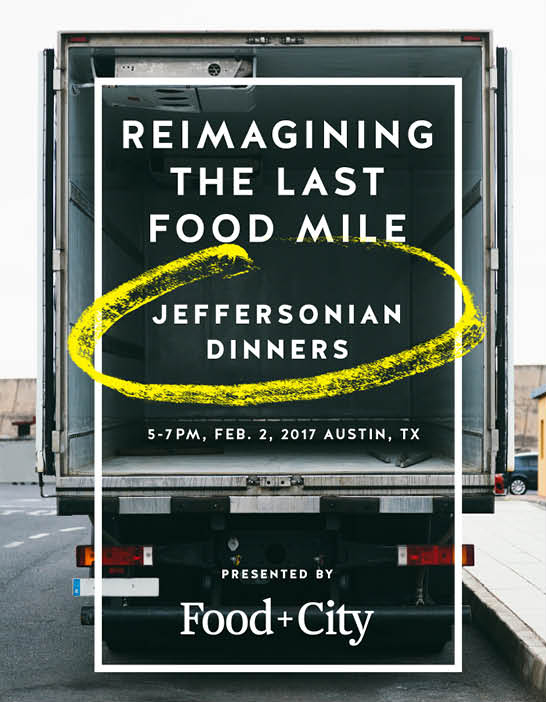
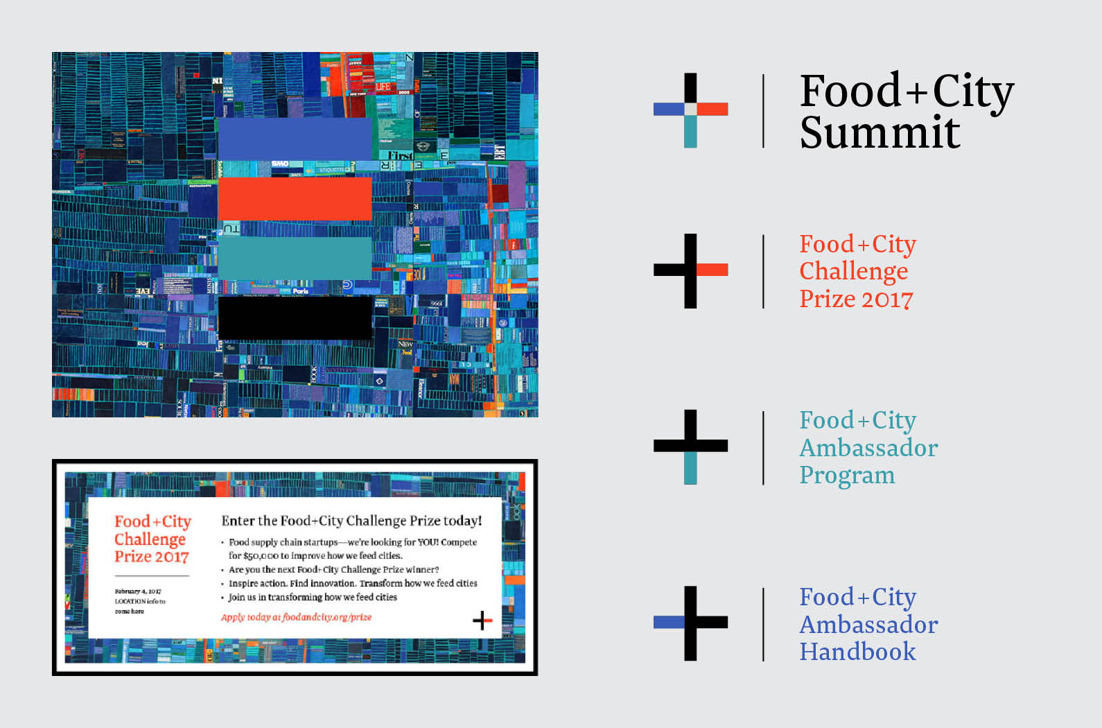

Consistent use of type and color held the various subbrands and events together over time.
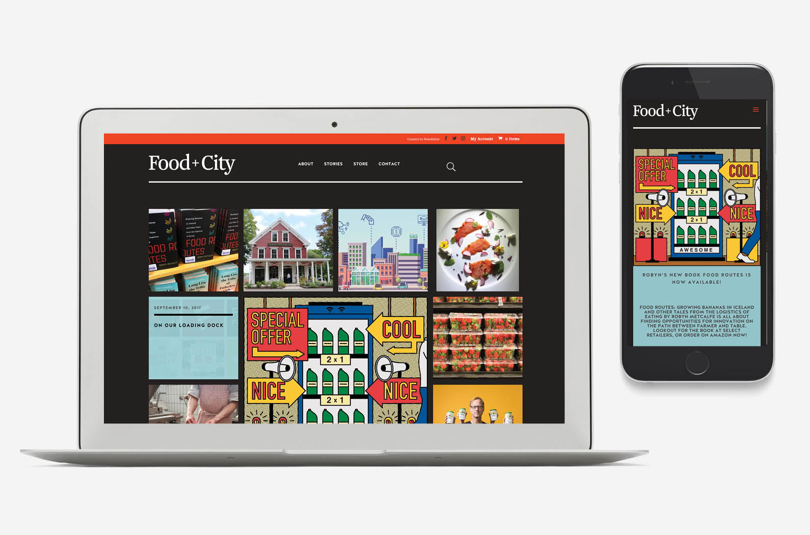
We created a website to surface magazine content and be the central hub for all things Food+City.
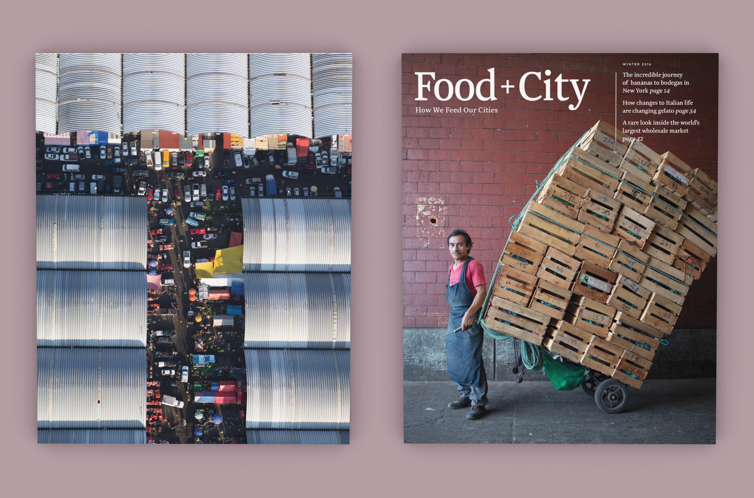
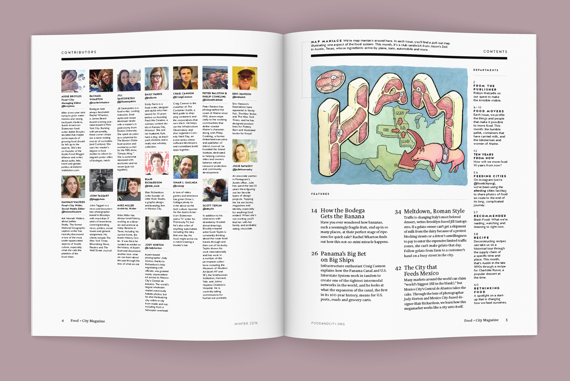
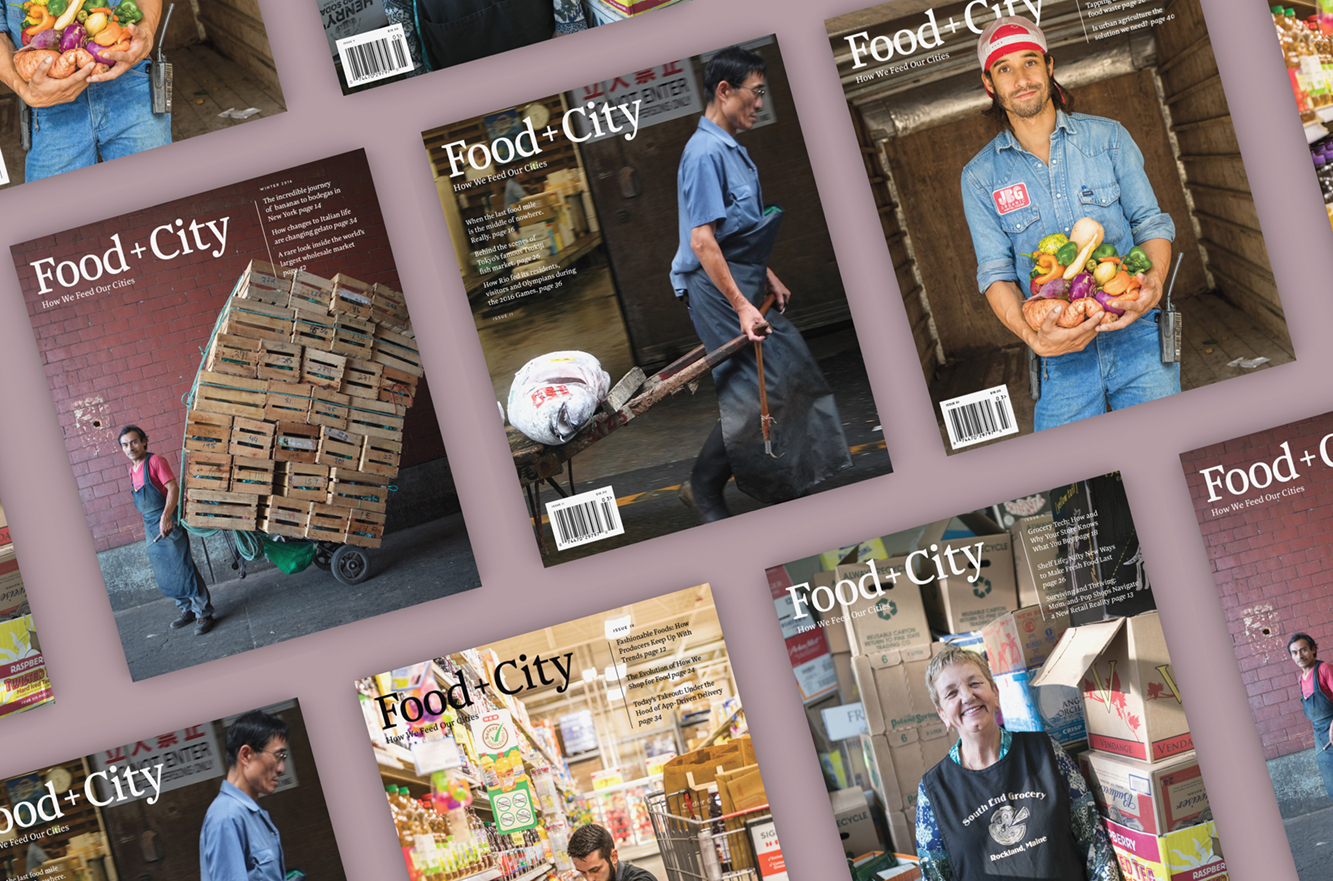
Issue I covers and spreads.
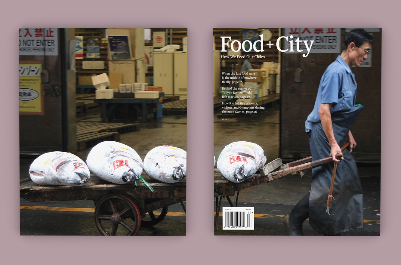
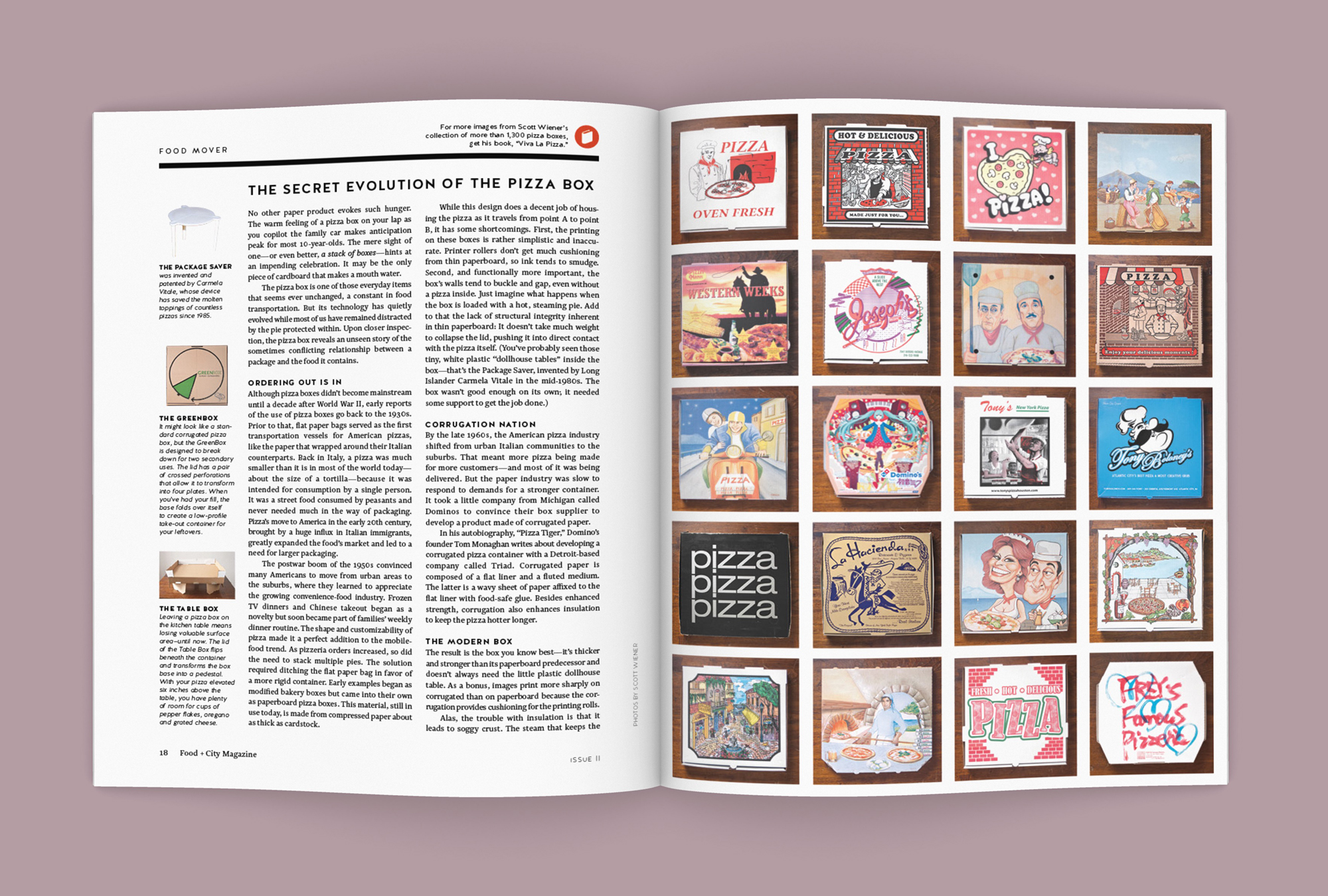
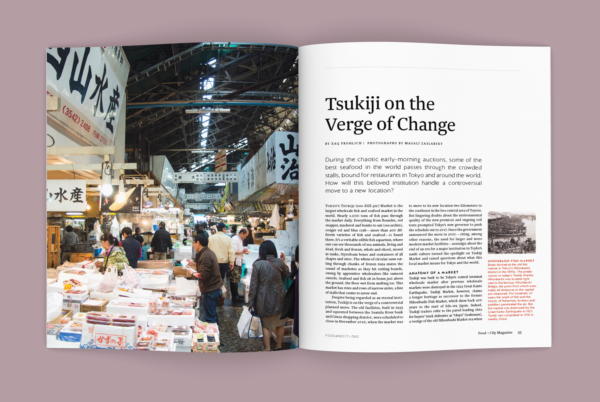
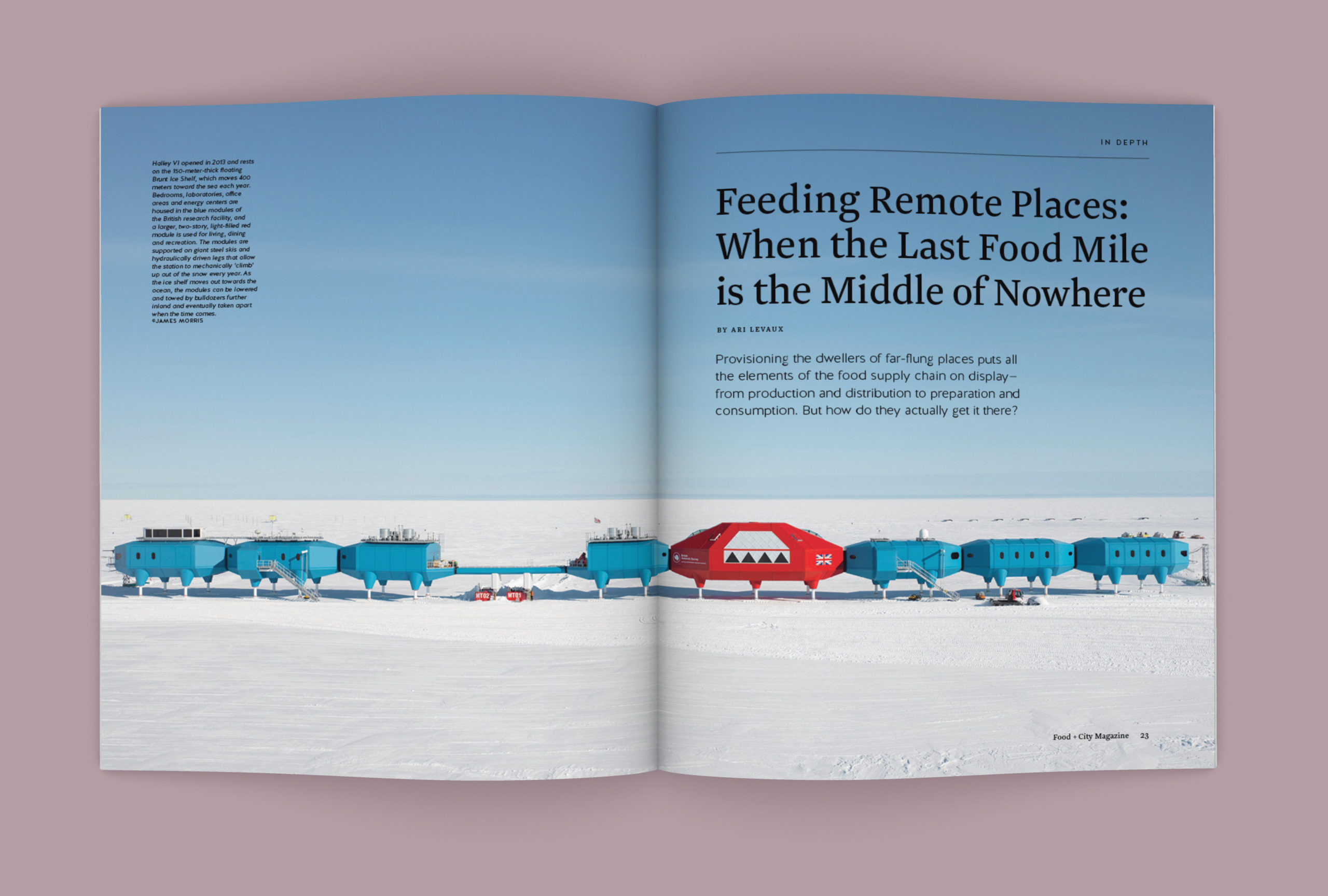
Issue II covers and spreads.
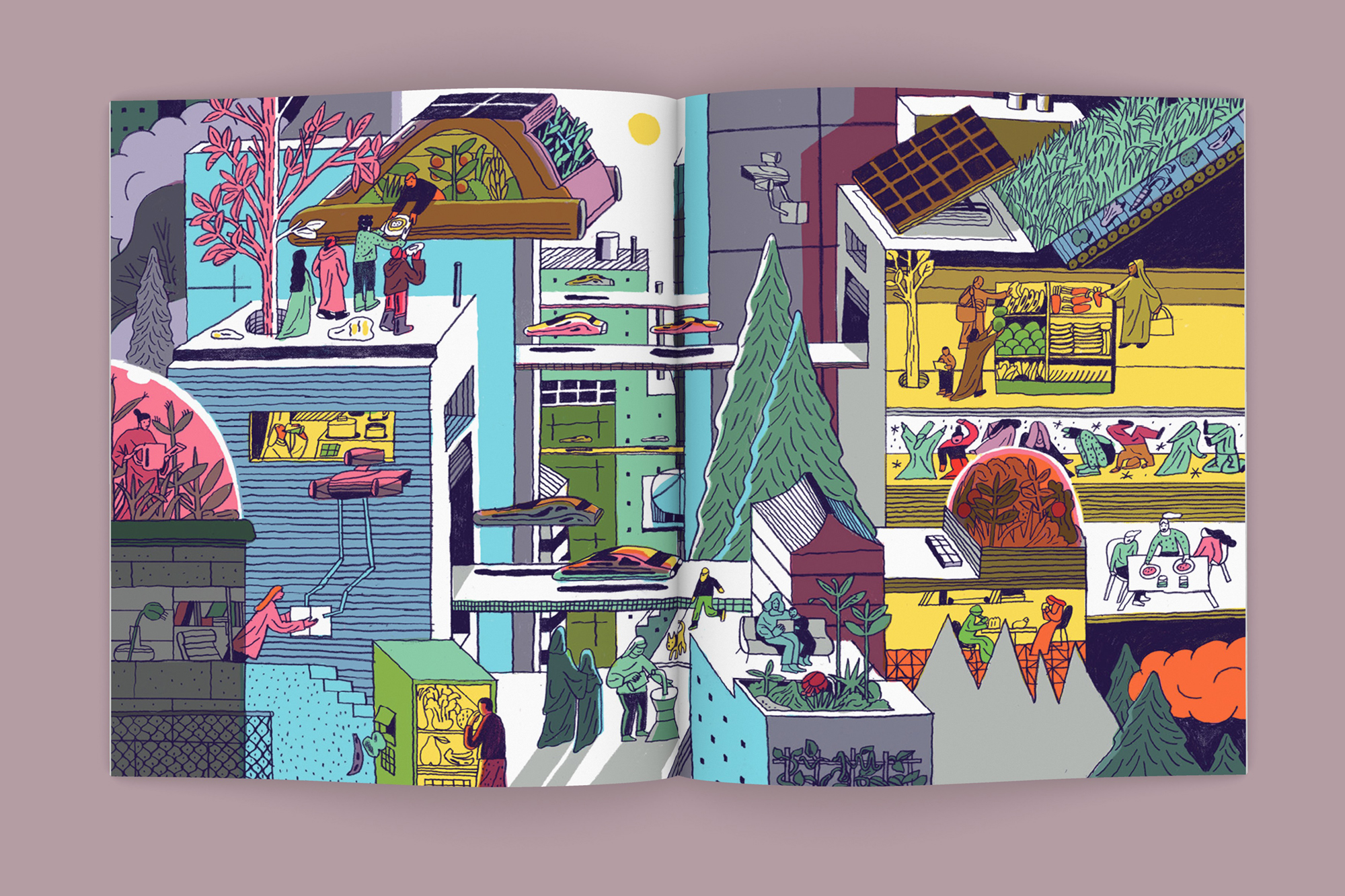
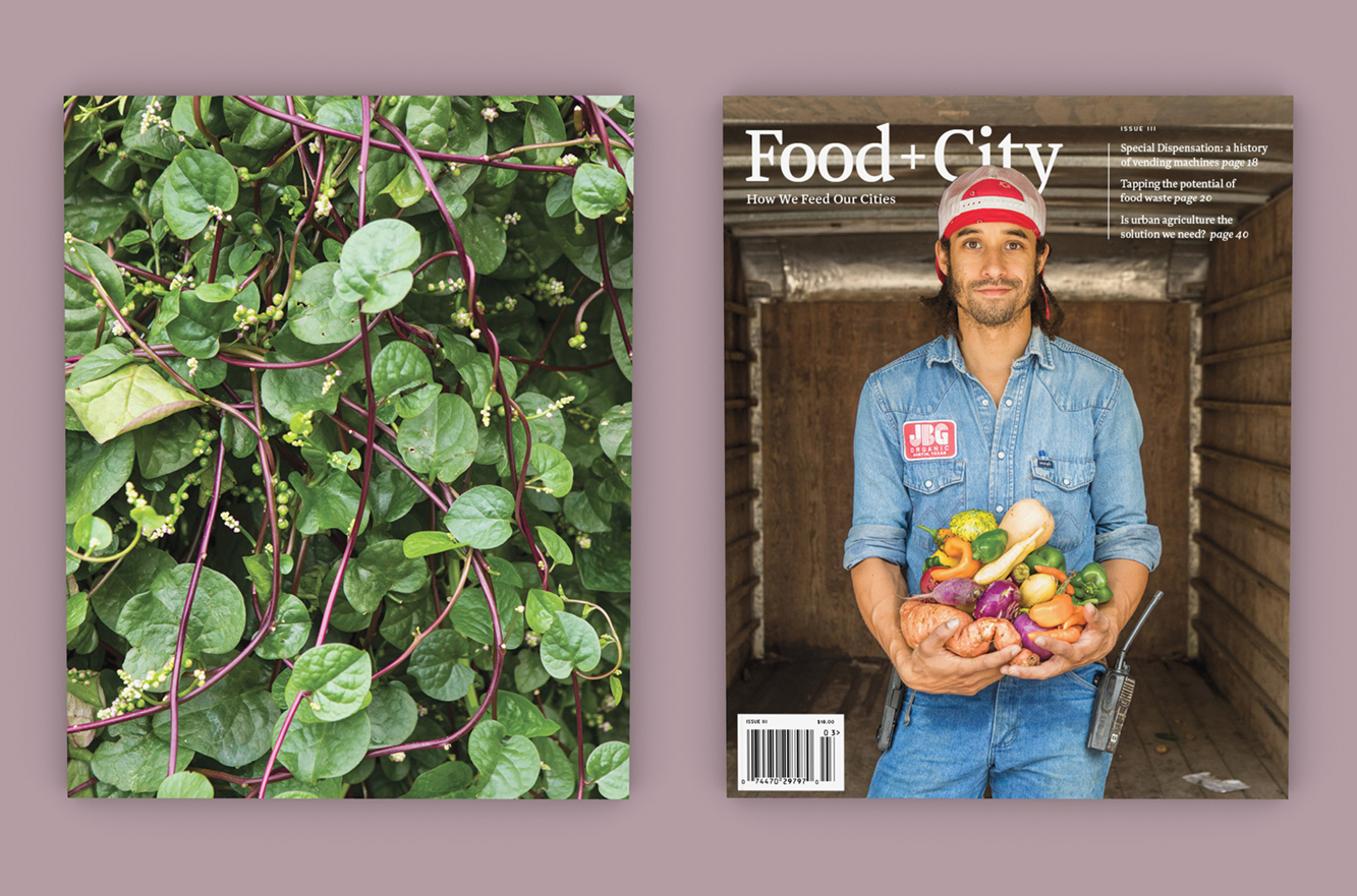
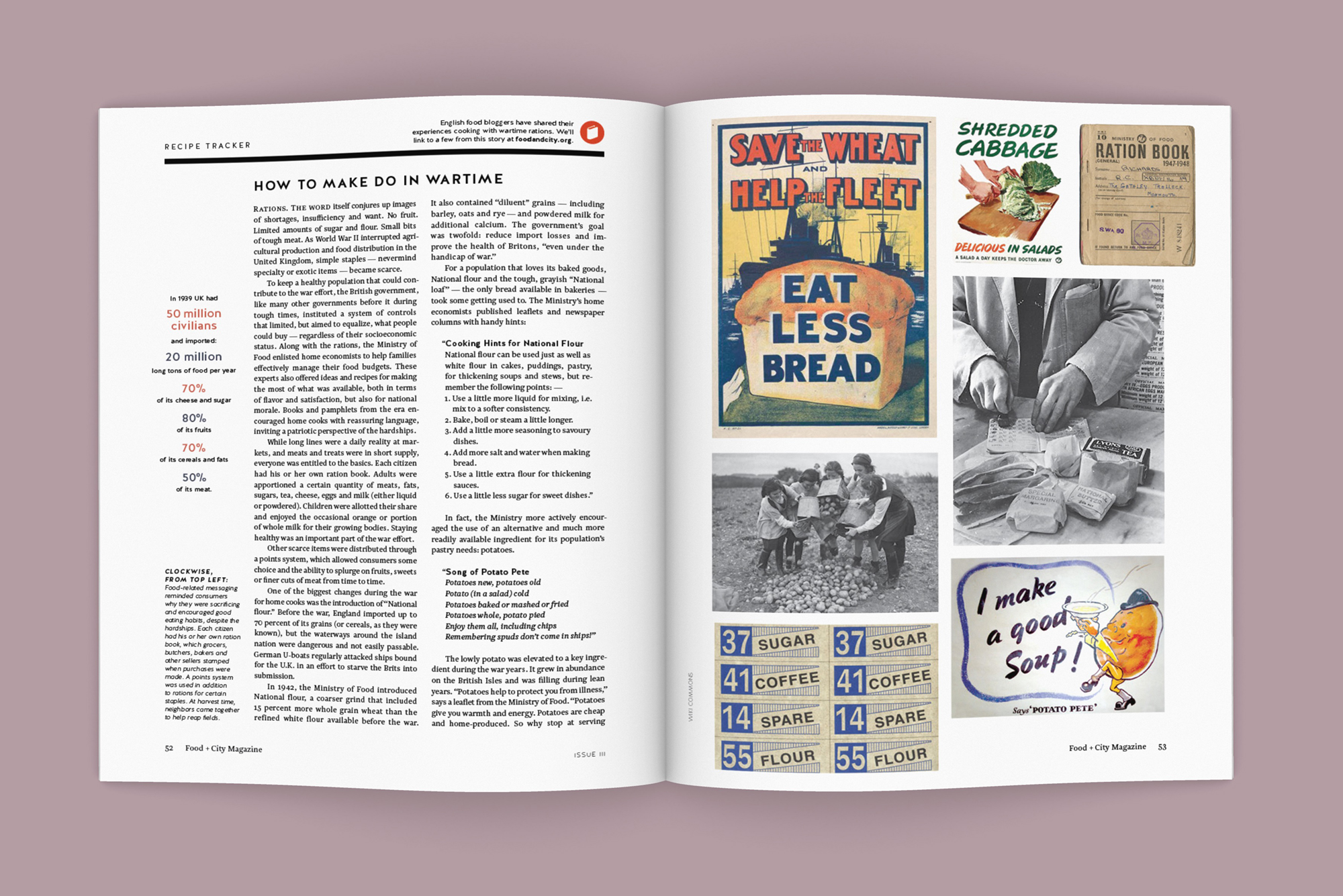
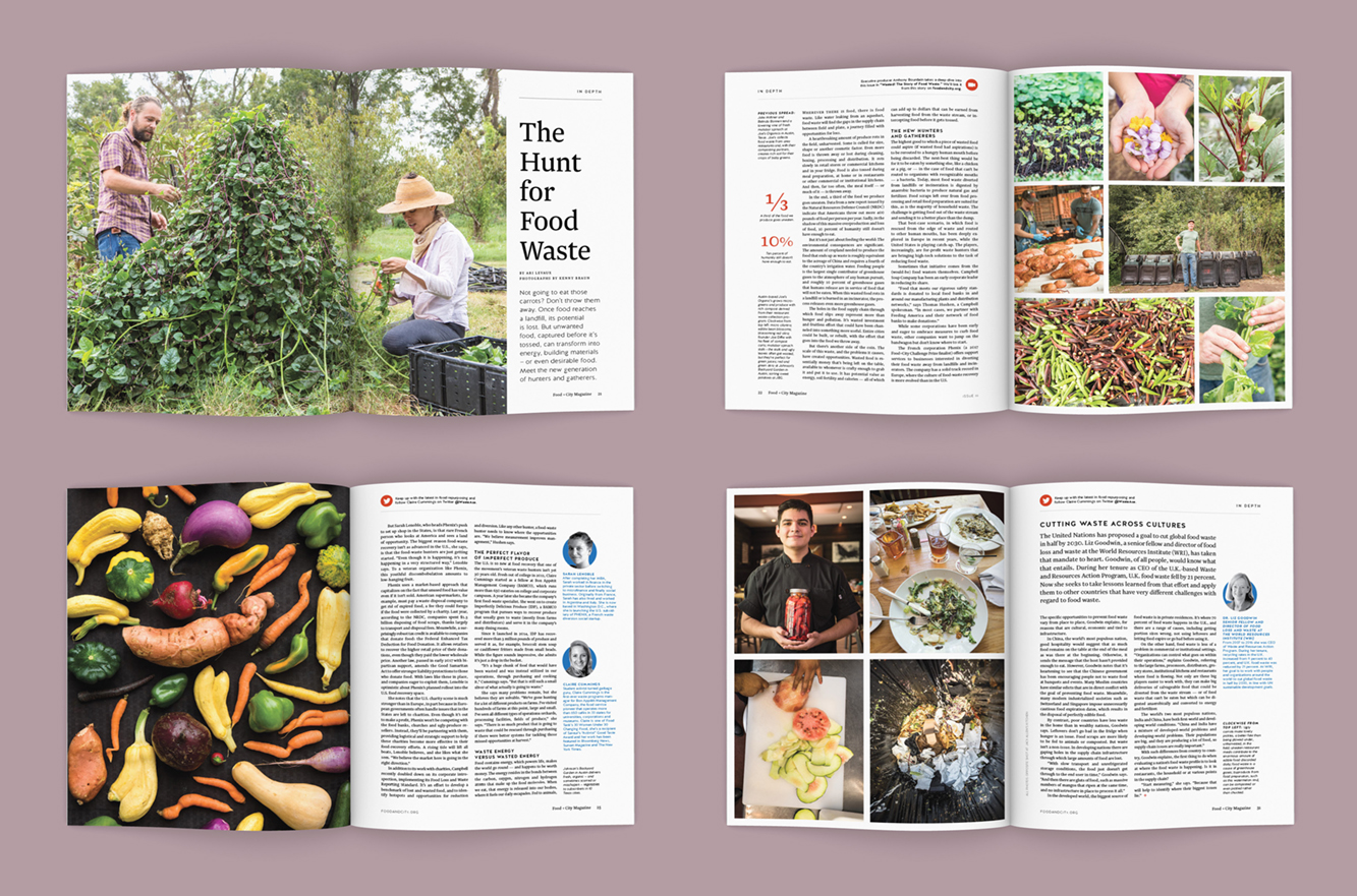
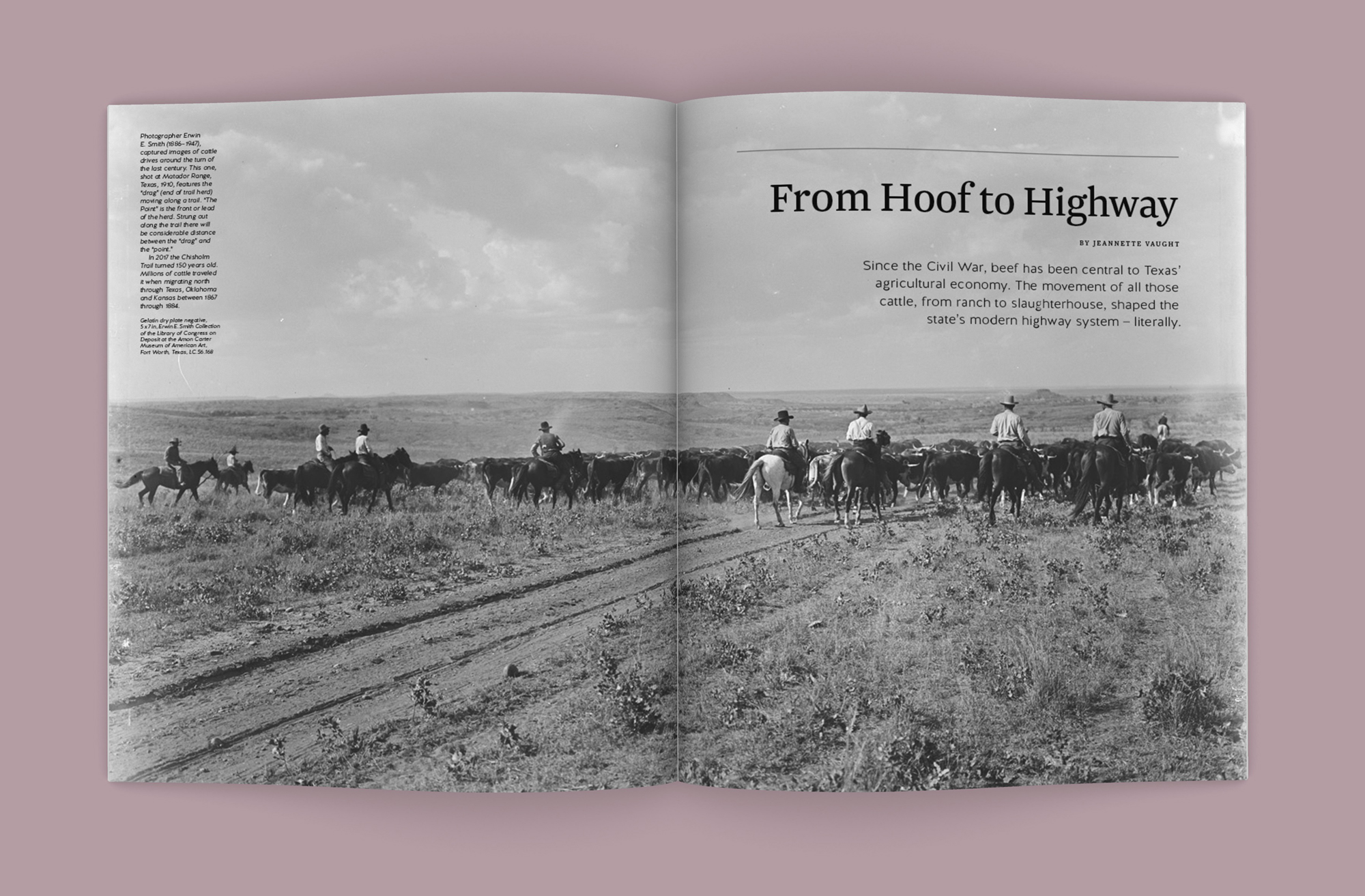
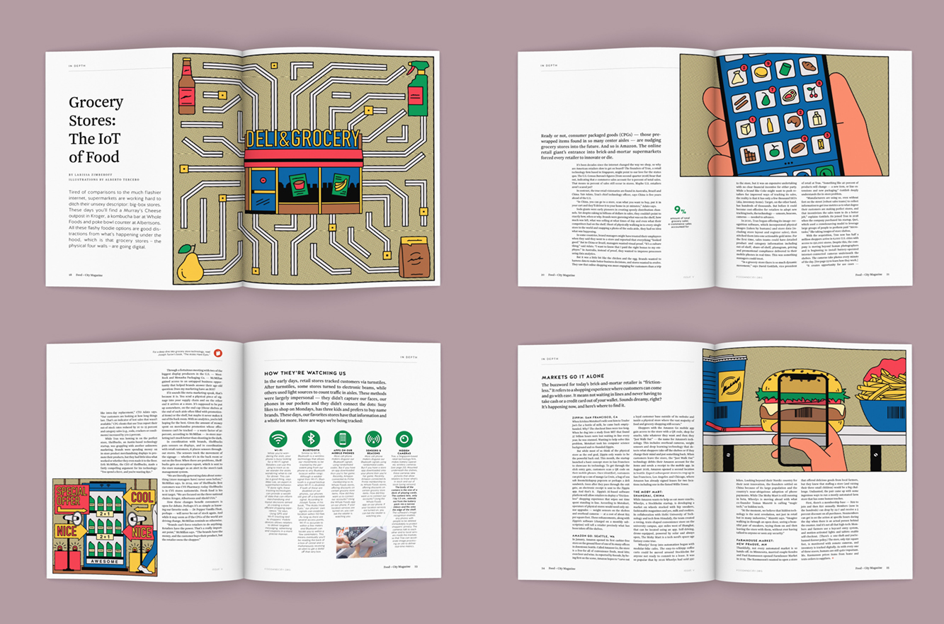
Issue III covers and spreads.
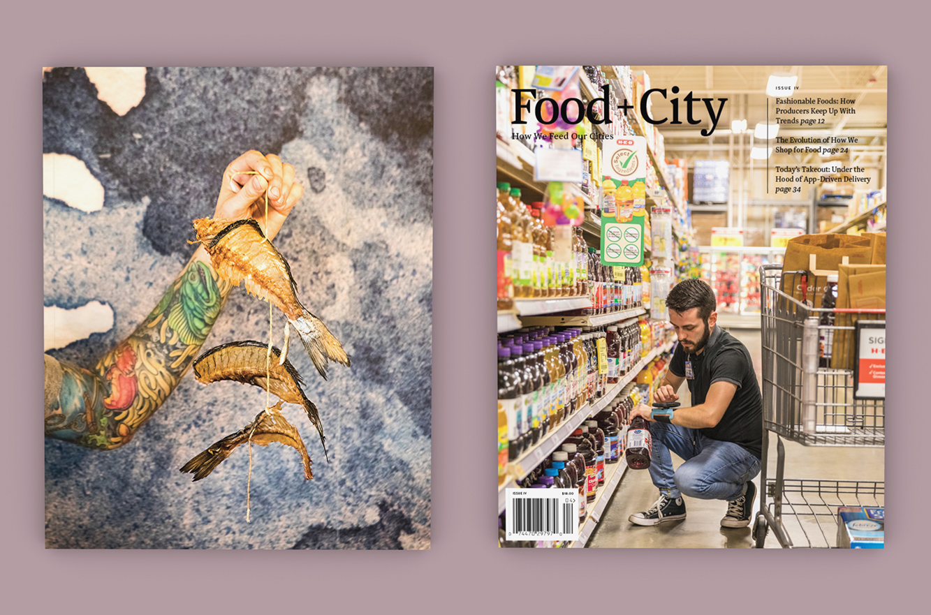
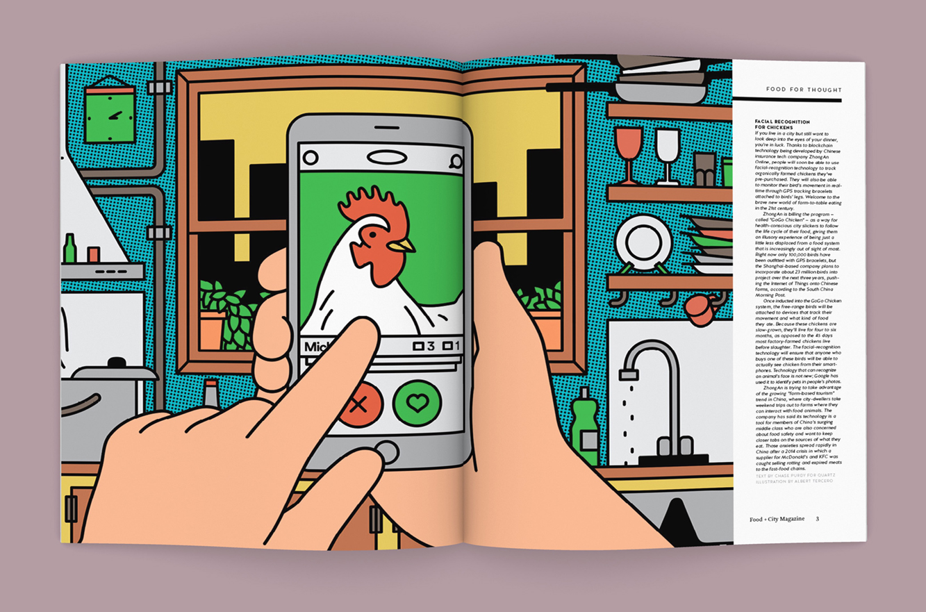
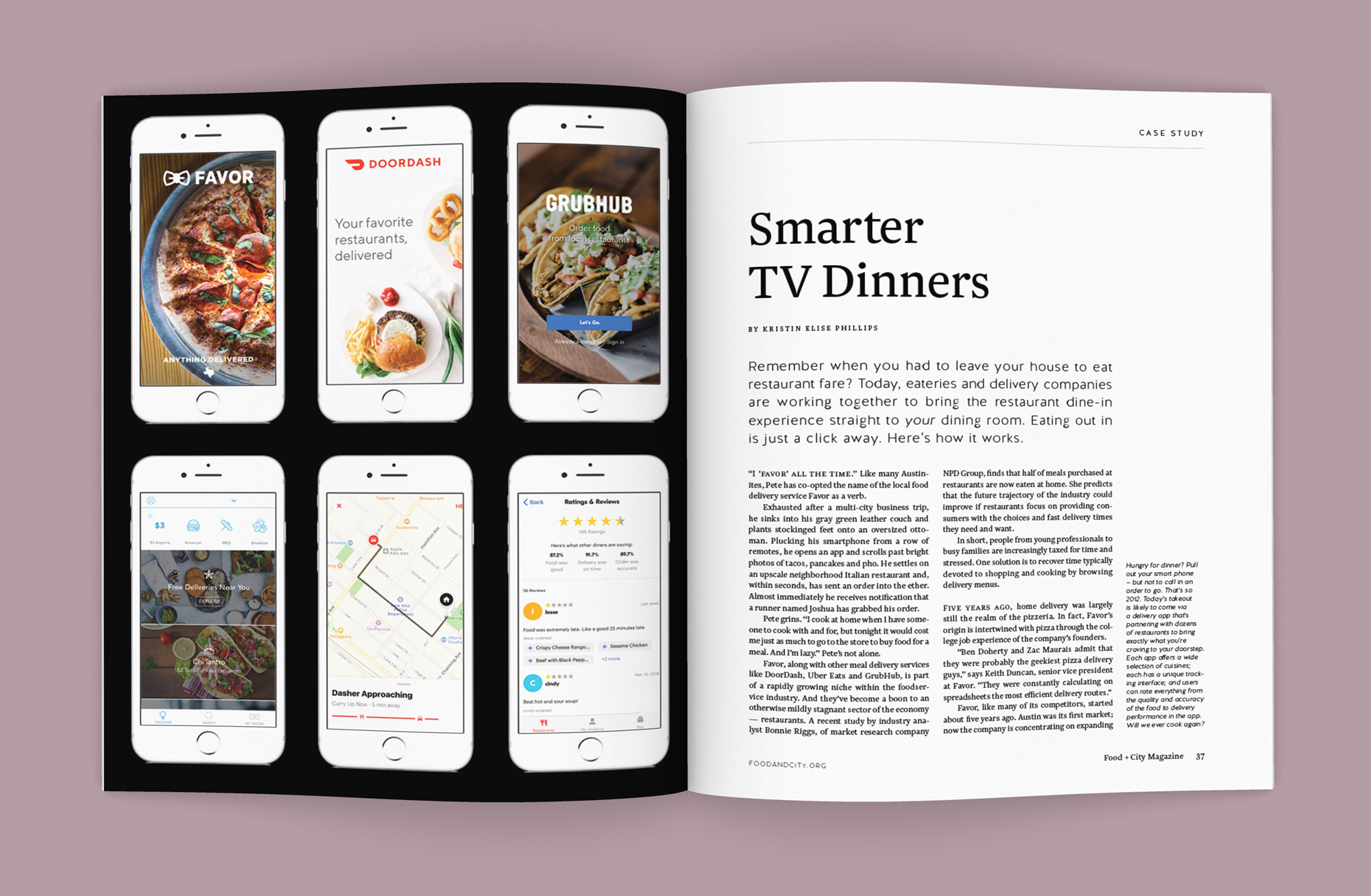
Issue IV covers and spreads.
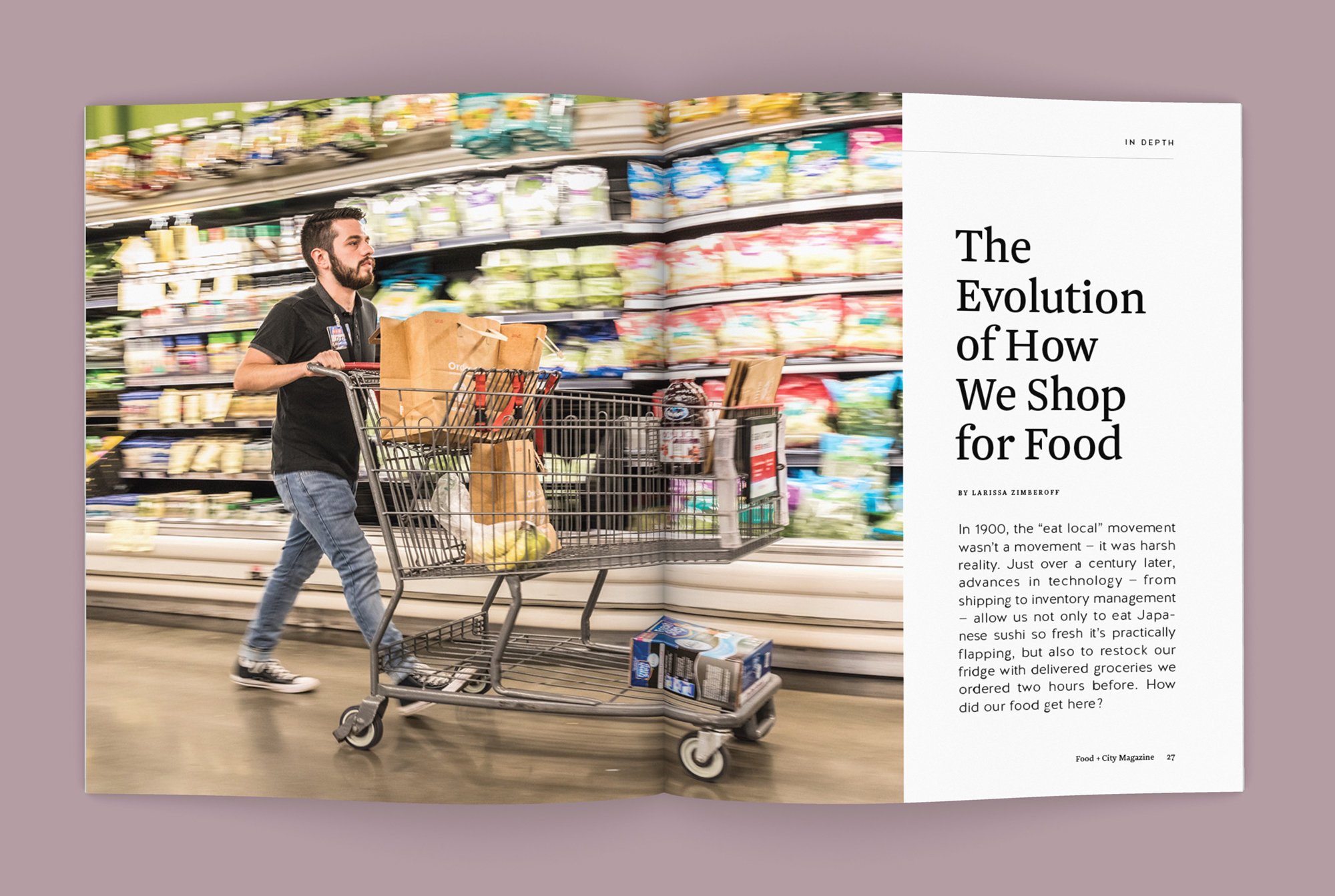
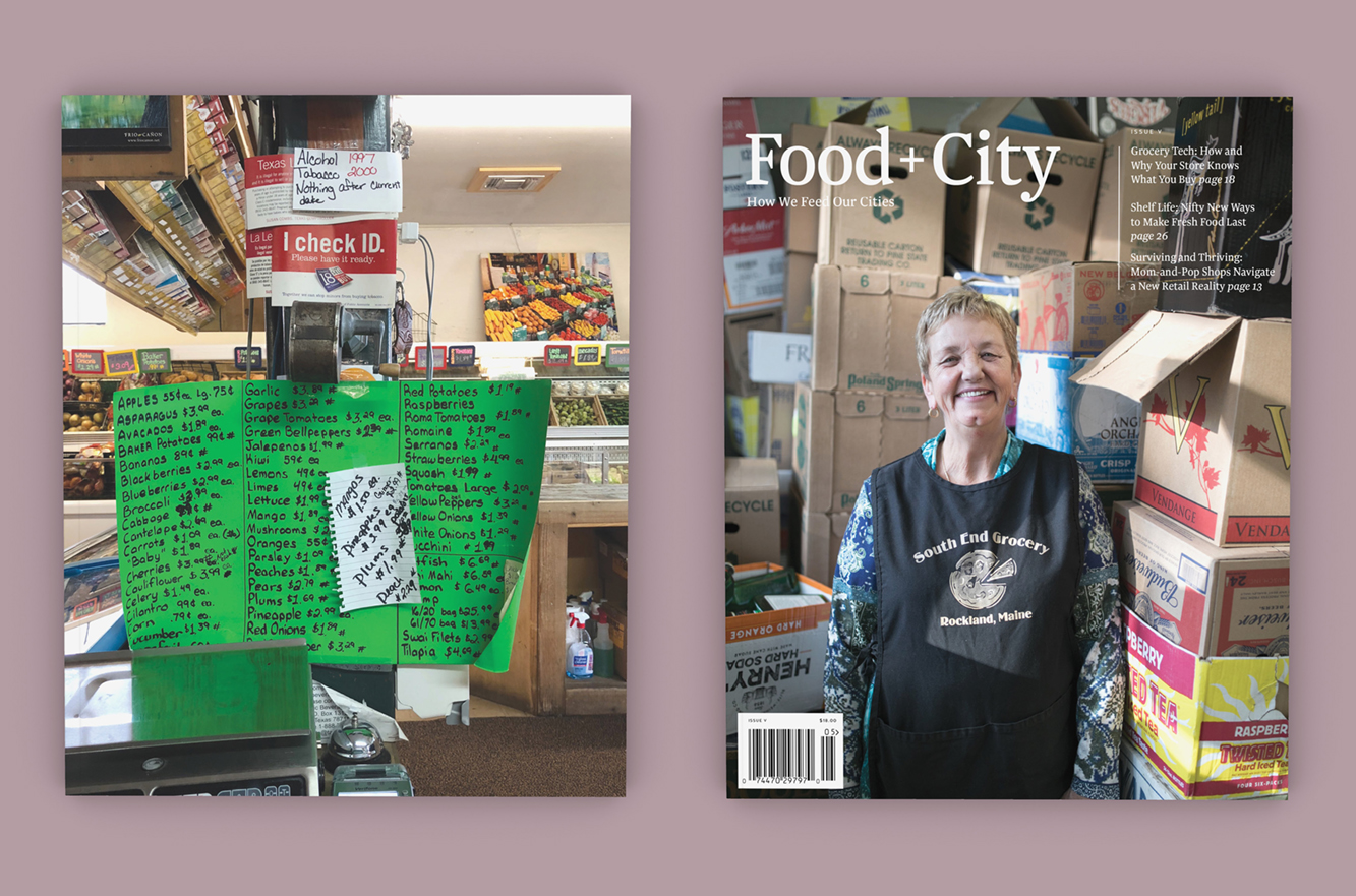
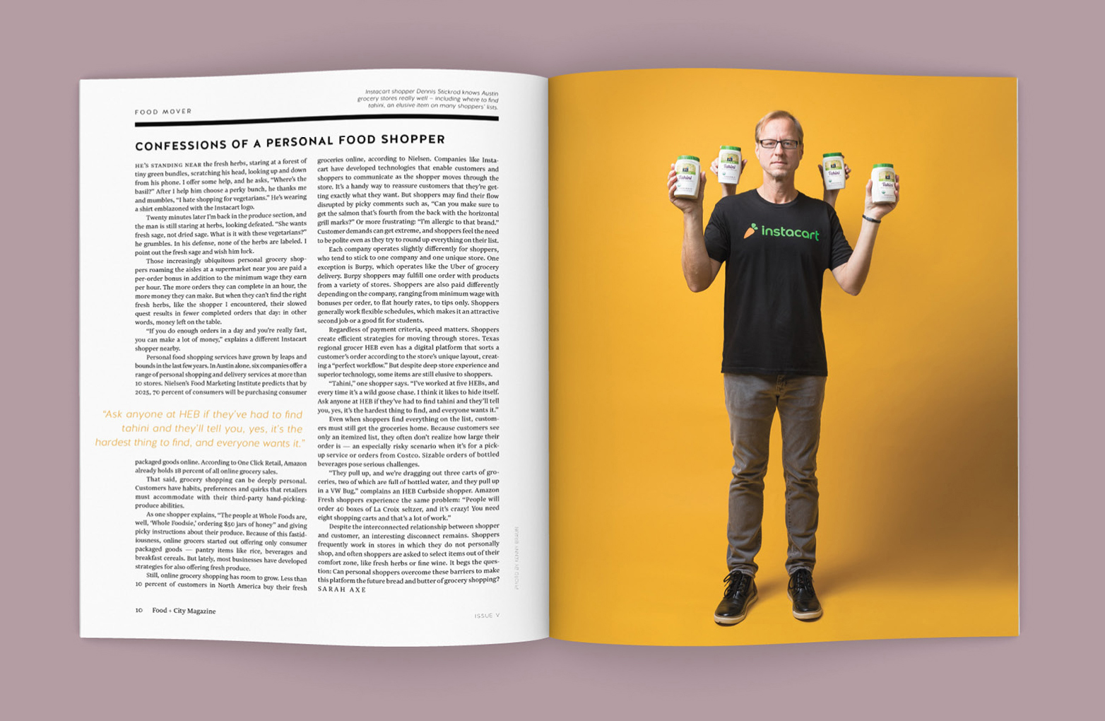
Issue V covers and spreads.
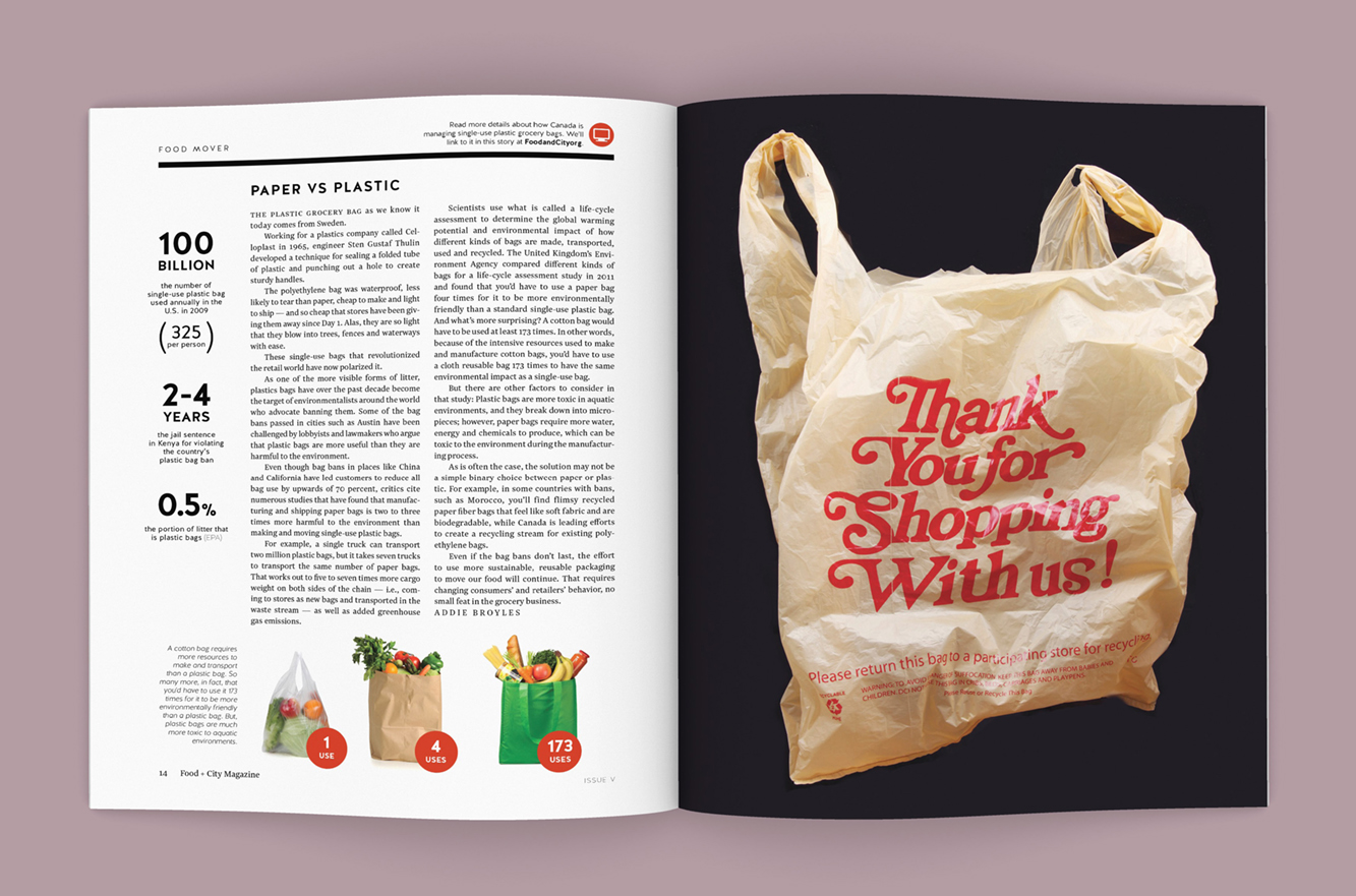
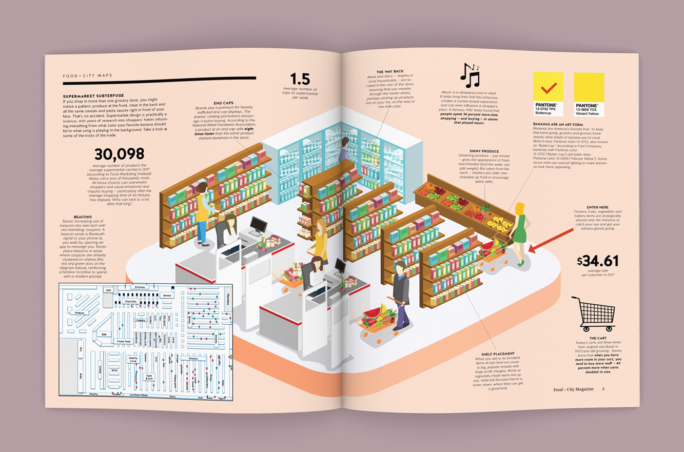
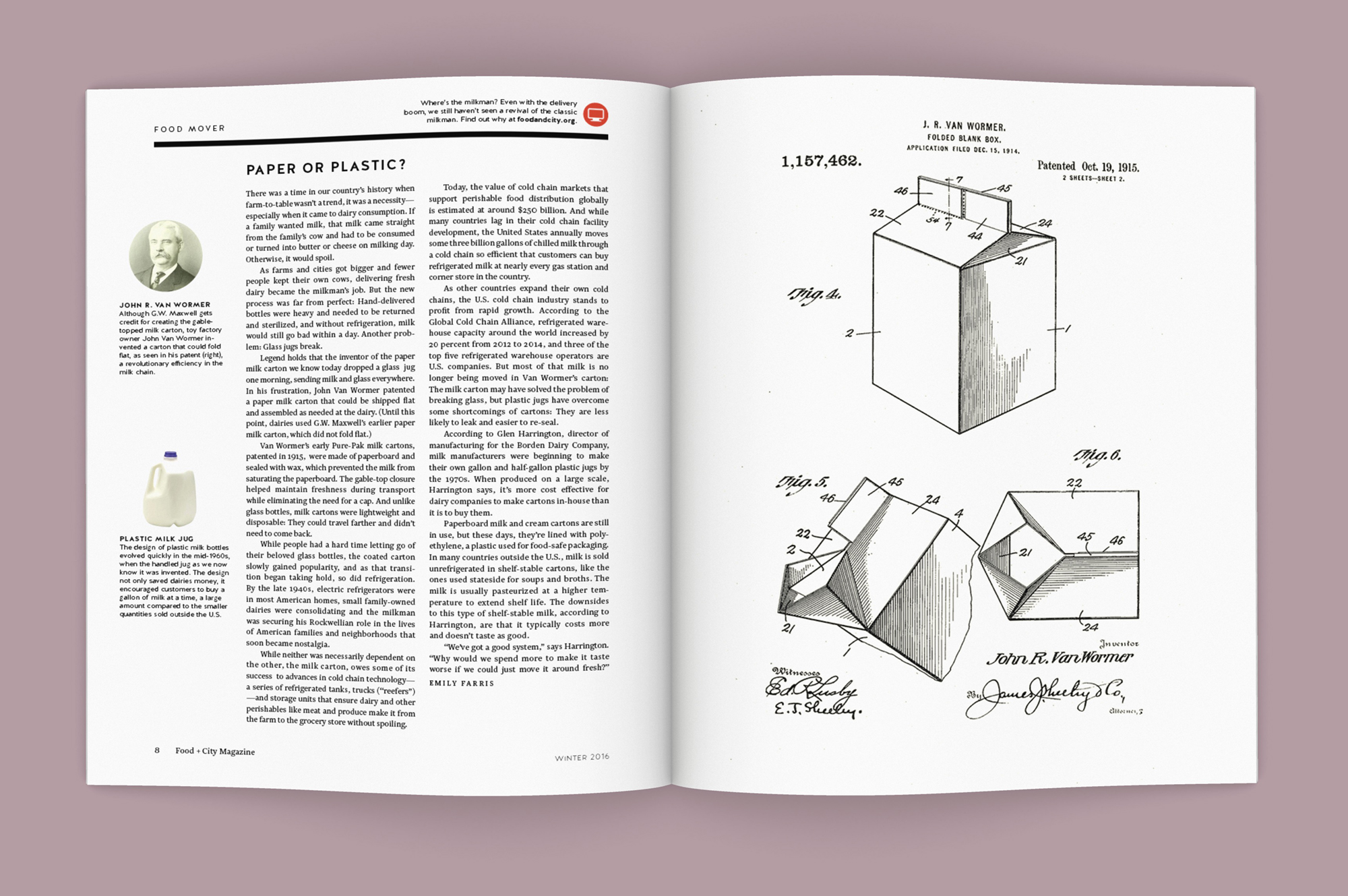
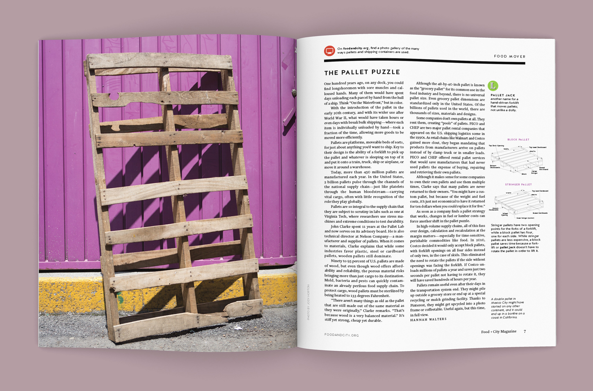
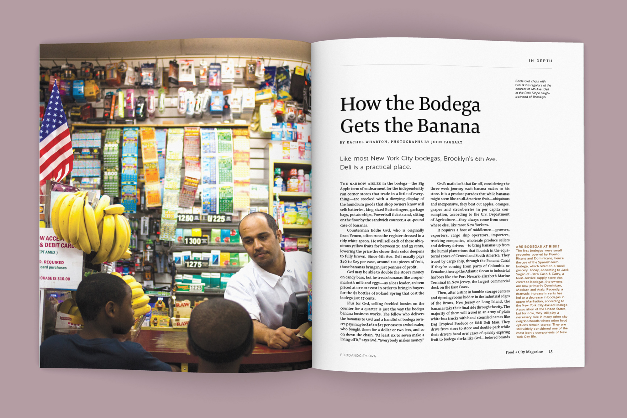
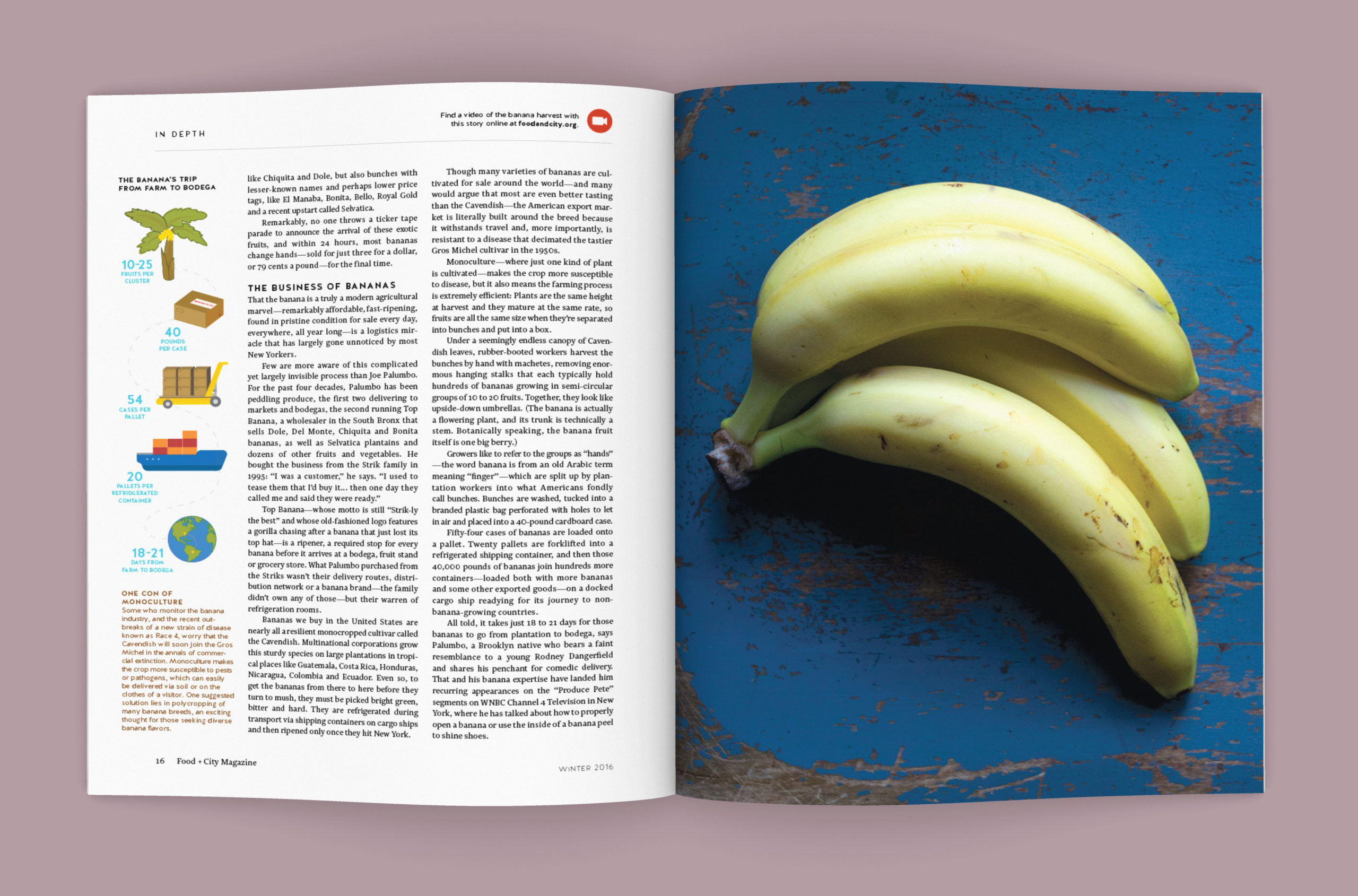
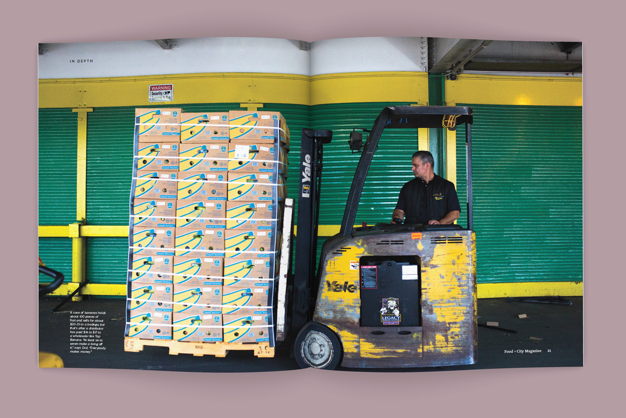
Simplifying complex ideas.
Simplifying complex ideas.
Simplifying complex ideas.
© Copyright 508 Creative 2020
© Copyright 508 Creative 2020